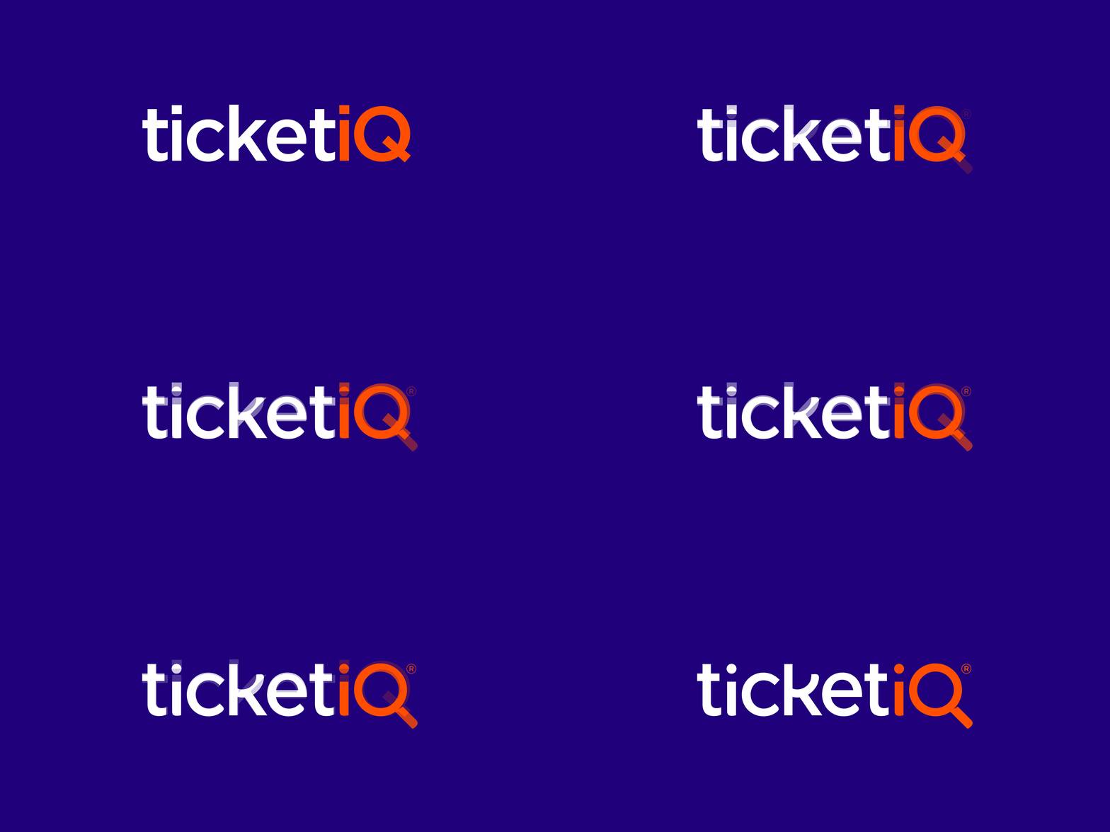
A higher IQ
Within 6 months of it's rebrand, TicketIQ's website conversion rate had increased by an 87% and the amount of active mobile app users was up by 90%.
For one of the largest US based online sports and concert ticketing platforms it was no mean feat to achieve these kinds of numbers and a true testament to how 'design' can fuel business growth.

When we say ‘design’ we don’t just mean a logo change, as this would have merely scratch the surface of a much deeper business challenge. For Tiqiq, we needed to effect the core of the brand and change it's direction.
After an extensive category audit we realised most, if not all, the competitor brands fight on price and many have a collection of complicated tools to enable users to price optimise their purchases. All this math was very complicated and it was only the most die-hard users that truly understood it.
We proposed that Tiqiq, needed to buck trend and go against the grain. So with a name change to TicketIQ we realised there was a lovely opportunity to let consumers discover more, and position the brand as an explorer.


And this was the perfect rationale to use the Q within the brand name and create a magnifying glass symbol.

Coupled that with a fresh, bold and bright web-friendly colour palette along with a new distinctive design language, TicketIQ had all the assets it needed to relaunch and in-turn gain a considerable market share.
One year after launch the return on investment for TicketIQ is estimated to be over 100x that of the design fee.


